Showing posts with label art quilts. Show all posts

Monday, October 14, 2019

Mini Quilts with Cats and Birds


"Cat Love" (top left), "Cat Love Profile," (top right), and "What?" (bottom), all 6" x 6" x.5", handmade by Pam Geisel, October 2019

For most of my adult life I've always lived with a cat. They are often a joy to have around but as I type this, my current cat is just about on top of the keyboard.

"Tweet" and "Sing!" both 6" x 6" x.5", handmade by Pam Geisel, October 2019

Along with "Letting Go" and the two "Breathe" pieces, I also used some of the Robert Kaufman, Effervescence fabric (this is the "Mardi Gras" colorway) along with a rainbow stripe from Timeless Treasures and some white from my stash. The white used for the cats has small white circles on it and the white for the birds has a white zig zag on it.


All of these pieces were wrapped around a canvas frame.

More about Cat Love - Cat Love Profile - What? - Tweet - Sing

Sunday, June 12, 2016

Birds for All Seasons


I recently finished this custom order of four birds: (clockwise from top left) Carolina Wren, Goldfinch, Cardinal, Eastern Towhee. They are 8" x 6" each and the fabric was fused to a thick, double-sided interfacing, like what I use when I make quilted postcards. Then the fabrics were stitched down. Because the eyes were small, I used black beads for three of them (the towhee has a white sequin behind the bead), and I used a small white bead on the goldfinch.

The customer supplied the photos and plans on displaying them seasonally.

Sunday, July 7, 2013

Adventures in Design art quilts

Adventures in Design series, made by Pam Geisel June 2013 

My art quilt group, the Miami Valley Art Quilt Network, has been holding Study Group meetings once a month where we explore design principles while working through the book “Adventures in Design” by Joen Wolfrom.

Because my background is in graphic design and I am already familiar with most of these concepts I thought it would be fun to take the title of this book literally and make a series of quilts that explore design principles.

This series covers these design elements: Line, Color, Letters/Words, Proportion and Scale, Texture, and Shape. Over the next few days I will focus on each quilt and the concept it covers.

My quilts are on display along with quilts made by other members of the study group from July 1 through Aug. 31 in the Epiphany Gallery at South Park United Methodist Church, 140 Stonemill Road in Dayton, Ohio. The quilts can be viewed Mon.-Thurs. from 9 am-2 pm and on Sunday before and after the service.

Tomorrow...Adventures in Design: Line

More about the Adventure in Design series


Saturday, July 6, 2013

Adventures in Design: Line

“Lines of Text,” 9” x 7.5”, made by Pam Geisel June 2013

The first design element we worked with was “Line.”

In her book “Adventures in Design,” Joen Wolfrom says that Line is “the element that provides the simplest, most effective way to make your design possible.” It can define a shape, direction, or movement.

One of the assignments in the book was to take photos of images that illustrate vertical, horizontal, and diagonal lines. We had tickets to a Cincinnati Reds game so we went down early and I took photos of downtown that I thought emphasized this concept.

I was especially interested in this photo: the vertical lines of the fountain spray and in the buildings in the background, plus the diagonal lines of the tiles in the foreground of the fountain.

I decided I wanted a literal interpretation of the design element so I played with the concept “Lines of Text” and cut fabric that had words on it to use as the diagonal lines made by the tile.

Along with raw edge appliqué, a technique I used in this quilt was couching white yarn to the background to make the water spray.

Since this was the first quilt of the series, it determined the fabrics that I’d use for the background for all the other quilts, and it turns out I had just enough of to make all six. I also decided I’d use the fabric with words on it in all of the quilts.

Tomorrow...Adventures in Design: Color 

More about this quilt and the Adventure in Design series


Friday, July 5, 2013

Adventures in Design: Color

“Colorful Language,” 9” x 7.5”, made by Pam Geisel June 2013

The design element for this quilt is the most visible concept: color. Color can create mood, evoke feelings, and create visual drama.

For our assignment we were given a set of color chips and told to select a color we consider to be ugly. I chose Olive Green. Then we were told to pick colors that would go with the ugly color and make a quilt with it.


When I got home and looked at my fabric, I had several olive green pieces that I really liked so to me there was a big difference between a flat color on a color chip and the rich color of a textured or batik fabric. Not to mention I have a lot of olive green clothing, especially pants and shorts so the color must not be that ugly to me.

There are a lot of phrases with the word color but not a whole lot that don’t actually have to do with color so for my literal interpretation I went with a sanitized version of “Colorful Language,” although two of my words are also verbs (“SHOOT a photo” and “DARN a sock”).

To make this quilt I printed the words in reverse, traced onto fusible web, fused to back of the fabric bubble (the darker color) and cut out the letters, much like reverse raw edge appliqué. I placed these fabric bubbles over lighter color fabric.

For font geeks: “Shoot” is AR Christy, “Darn is Showcard Gothic, and “Geez” is Matisse ITC.

Tomorrow...Adventures in Design: Letters/Words

More about this quilt and the Adventure in Design series


Thursday, July 4, 2013

Adventures in Design: Letters/Words

“Love Letter,”  9” x 7.5”, made by Pam Geisel June 2013

The design element for this piece is the use of letters or words as graphic elements. The use of text as a graphic element is more noticeable in graphic design but has been become more popular in fiber arts.

Our assignment was to choose a letter and print it out in several different fonts, then play around with it: stretch it, rotate it, whatever. I wanted to represent the capital letter ‘E’ without actually using an ‘E’ so I played around with upside-down ‘3’s and ampersands. (Fun fact: the ampersand symbol originated as the letters ‘e’ and ‘t’ squished together.)


The literal interpretation I went with is a love letter. (See if you can find the letters ‘L’, ‘O’, and ‘V’ in the envelope; the ampersand can also be read as the letter ‘E’.)

For this quilt I made a fabric envelope and appliquéd it to the quilt top.

For font geeks: the ampersand is Adobe Caslon Pro.

Tomorrow...Adventures in Design:  Proportion and Scale(s)

More about this quilt and the Adventure in Design series


Wednesday, July 3, 2013

Adventures in Design: Proportion and Scale(s)

“Fishy, Fishy” 9” x 7.5”, made by Pam Geisel June 2013

Proportion and Scale are the design elements for the next piece. In her book “Adventures in Design” Joen Wolfrom defines Proportion as “how shapes interact with each other within a design” and Scale as “a composition and its total design.” It is also a good way to let the viewer know that something is nearer or farther away, and also what is most important.

Our assignment was proportion is a slightly different sense. Instead of the proportion of shapes, we were given a photo and instructed to make a quilt using the same colors in the photo in the same proportion. 

Luckily for me the colors I’ve been using all along were in the photo I was given. (OK, there's a bit more dark blue in my quilt than in the photo, but it was a place to start.)

For my literal interpretation I decided to use two fish for my subject matter. One is larger with larger scales and a larger eye, and a smaller fish with smaller scales and a smaller eye, although in this design the smaller fish could also just be a smaller fish. Of course literally scales are part of a fish.

Some techniques I used include couched thread for the seaweed and hand-attached mussel shell “coins” for the fish scales.

Tomorrow...Adventures in Design: Texture

More about this quilt and the Adventure in Design series


Tuesday, July 2, 2013

Adventures in Design: Texture

“Every Fiber of Her Being,” 9” x 7.5”, made by Pam Geisel June 2013

The next design element, Texture, adds “extra spice and visual richness to a design” states Joen Wolfrom in her book “Adventures in Design.”

Unlike most 2-D graphic design where texture is indicated, in fabric texture is already literal. For this piece I added some crocheted yarn for the shawl and soft, fuzzy yarn for the hair.

The other part of our assignment was to use a geometric shape placed on top of the color wheel to determine the colors to be used in this quilt, although neutral colors can also be added.

I used a triangle (a triadic color plan) and got blue-violet (the background), green (her dress), and orange (her hair).


As a fiber artist I’ve always loved the phrase “With every fiber of my being” so I decided to do a literal interpretation of that phrase.

Is this a self portrait? Well, I’m a pale woman who wears glasses. My hair is blonde (and currently shorter than here) but not only didn’t I have any yarn that was close in color to my hair, it also wouldn’t have met the color criteria for this quilt. Plus the orange/red hair goes better with the colors in the other quilts in this series.

I couched the yarn on this quilt and I also couched the crocheted doily with the same color thread, which worked better than I thought it would. The glasses and face are hand-stitched.

Tomorrow...Adventures in Design:  Shape

More about this quilt and the Adventure in Design series


Monday, July 1, 2013

Adventures in Design: Shape


“Bent Out of Shape,” 9” x 7.5”, made by Pam Geisel June 2013

The final design element is Shape.

Our assignment was to first doodle some organic shapes in a piece of paper. Then we divided another piece of paper into rectangles, a geometric shape. Then we drew one of the simple organic shapes inside the rectangles, expanding and stretching it to fit as needed.


I started off with a leaf shape, although once I ‘bent it out of shape’ it looks more like a tear drop to me. I emphasized the shape by making by highlighting half of the leaf with a lighter color. I really like how the four pointed ends come together creating a focal point.

More about this quilt and the Adventure in Design series


Sunday, June 23, 2013

Seasons of Life: Aullwood's Annual Art Quilt Exhibition

"Seasons" fabric mosaics by Pam Geisel, frame sizes are 5" x 7", art is 2.5" x 2.5"

When I make my fabric mosaics I arrange small pieces of fabric on a backing fabric or innerfacing then I cover them with tulle and quilt the layers together and frame them. For this set of four, each one features a tree in a different season and the mats were cut so they appear in a different place in the black wood frame. The frames are 5" x 7" but the art is only 2.5" x 2.5".


For "Spring" I used a light green for the background and sage green, white, and pink for the new leaves and blossoms.


For "Summer" I used a richer, darker green for both the background and also the leaves.

;
For "Autumn" I used yellows, oranges, and reds for the leaves both on the tree and on the ground.


For "Winter" I used a white background to represent snow and no leaves on the tree but there is a tiny cardinal sitting on a branch.

More about Seasons fabric mosaics


These pieces will be in the 21st Annual Art Quilt Exhibition at the Aullwood Audubon Center and Farm which is June 29-Aug. 25. Aullwood is located at 1000 Aullwood Road in Dayton, Ohio and is open Mon.-Sat. 9 am-5 pm and Sun. 1-5 pm. There will be an artist reception on Sun., July 14 from 2-4 pm.

Wednesday, September 26, 2012

Dayton Landmark Quilts are Back!


If you missed seeing the Dayton Landmark slice quilts when they were at the Schuster Performing Arts Center in the spring, or if you just want to see them again, here's your chance. They will be on display on the second floor of the Dayton Metro Library, 215 E. Third St. in Dayton through Dec. 27, 2012. The library is open Mon., Tues., and Thurs. from 9:30 am to 8:30 pm; Wed., Fri., and Sat. from 9:30 am to 6 pm; and Sun. from 1-5 pm.

There is an opening reception this Sun., Sept. 30 from 1:30-4:30 pm.

This time the quilts, made by members of the Miami Valley Art Quilt Network, will be displayed with the original photo that each quilter worked from, and we will also have the piece of the Dayton Skyline that wasn't finished last spring.

This set of Dayton Landmark quilts will also be at the South Park United Methodist Church, 120 Stonemill in Dayton, from Jan. 6 through Feb. 27, 2013, and at Southminster Presbyterian Church, 7001 Far Hills Ave. in Centerville in March and April, 2013.

Since the exhibit is on the second floor, some of us decided to make small Dayton Landmark quilts to go in the display case on the first floor to let library patrons know about the exhibit upstairs. I made two small Dayton Landmark quilts of the Dayton Dragon's stadium, Fifth Third Field titled "Take Me Out to the Ball Game."

"Take Me Out to the Ball Game (outside)", 11" x 8.5", Sept. 2012

Above is the view of the stadium from the outside, with the giant bats and balls. The red stitching on the balls is actually hand stitched. (Click on any of the photos for a larger view and to see the stitching details.)

  "Take Me Out to the Ball Game (inside)", 11" x 8.5", Sept. 2012

And this is a view from the inside. Because the quilts are small, in this quilt the batter is less than 1.5" tall and the pitcher is about 1" tall. At this size, the out fielders were too tiny to make with fabric.

Because we had such a great time making these quilts, the Miami Valley Art Quilt Network is planning on doing another round of Dayton Landmark quilts. We all have our assigned pieces, and the plan is to have them finished by April, 2013. I'll be sure to post photos of those and announce upcoming exhibits.

More about Take Me Out to the Ball Game

Sunday, March 25, 2012

Zig Zag Twist - Project Quilting

 
“Zig Zag Twist” 22" x 25.5", made for Project Quilting, 
Season 3, Challenge 6: Ziggin’ and a Zaggin’, Mar. 2012

Recap of the challenge: “Ziggin’ and a Zaggin’”
This week’s inspiration is zigzag. Your challenge is to go beyond the basic zigzag quilt

First I looked at other Zig Zag quilts on-line and I found lots of lovely quilts, most with white background. I also looked at how to make a Zig Zag quilt and one person wrote that they are made of half-square triangles, and I remembered that I had several half-square batik triangles left over from another project.


So I got the triangles out and started playing around with a layout idea. At first I thought I’d make a square quilt with three zig zags so I picked out the pink, red, and purple triangles. As an afterthought, I also took out some blue ones.

I tried them on a few different color backgrounds but decided on black. I’ve used batiks and black before and I love the way it makes the color pop. I played around with moving them apart both horizontally and vertically and finally decided to put a thin black line between the colored pieces horizontally.


On a whim I turned the zig zag pieces on an angle…liked that, but I’d want to square it up. I decided to make some fabric mosaics (small pieces of fabric fused to a backing fabric, covered with netting then quilted in place) to use to contain the space the zig zags were in.

I added black fabric to square it up but it needed more so I made wide black borders. I couched a variegated yarn to contain the zig zags and the fabric mosaics.

For the quilting I used black on the color zig zags and fabric mosaic parts, and color fabric on the black zig zags that started at one fabric mosaic and went to another. I finished the quilt with a strip-facing technique for the binding.

More about Zig Zag Twist

= = =
You can click on the photos to see them larger.

To see the other entries go to the Ziggin and a Zaggin page.

Sunday, February 26, 2012

Early Morning Nine Patch - Project Quilting

 "Early Morning Nine Patch"  43.5" x 18", made for Project Quilting, 
Season 3, Challenge 4: Barn Quilt, Feb. 2012
Click on the photo to see it larger and with more detail

Quick recap of the challenge: 1. Your inspiration for this week is Barn Quilts.

You might have noticed recently that there have been quilt squares painted on the side of barns. Most of the time you can find maps in certain areas or counties and take a driving tour to see the quilt squares. Greene County, Ohio (where I live) has one. The first tour was in Adams County, Ohio, a 2 hour drive from where I live. You can read about how the first one got started here.

When I saw the challenge for this week, I knew what I wanted to do. I'd recently been thinking I'd like to make a quilt that was wider than tall and I thought a landscape would be nice. Originally I wanted to use thin strips to make the background, blending blue colors to make the sky and green for the field.

I went to my fabric stash and realized that I have very few pieces of fabric that are 44" wide, most of what I have are smaller chunks. Some of the fabrics I really wanted to use were only 10" wide, so I decided to make five sections that were about 9" wide. I didn't want the same fabrics next to each other with the exception of the top and bottom rows and where the land met the sky, so I added some strips to offset the pattern. The strips were 3/4" wide when finished.


I also knew I wanted to add some traditional squares into the background and since I was working with strips, Nine Patches seemed like an obvious choice but I used the same colors that were around them so they'd have a subtle effect. I machine pieced the background then machine quilted in with stitch-in-the-ditch, so the quilting isn't very obvious but quilting 3/4" apart helps the strips lay flat. 

I used my favorite strip-facing technique for the binding then started to make the barn.


I made the barn by paper piecing the quilt square with the front of the barn and then with the side of the barn. I wasn't sure what color to make the barn, red or brown, so I auditioned some fabric. The bright red was too much, the brown was too subtle. The deeper maroon red was looking good then I noticed on the selvage edge of one of the red fabrics that it was titled "Barn." When I say that I let the fabrics tell me what they want to be, it's not usually quite this literal. But it made the decision easier.

I fused the two red pieces to a piece of stabilizer and did some black thread painting to define the planks. Then I folded the edges over and machine appliqued it to the background. I used a piece of brown batik for the roof and appliqued it the same as the barn.

I fused the fences and attached them with raw-edge applique then couched some fun green yarn along the horizon line and in front of the barn to anchor the barn to the landscape and to give the appearance of grass.

A couple of quick pictures uploaded to the Project Quilting Flickr site and I was done just minutes before the deadline. I don't like working that closely to a deadline but was unable to do any sewing yesterday because we went to Athens, Ohio, to see one of my quilts that is in the "OH+5 2012" show at the Dairy Barn. We didn't take the official Athens Quilt Barn driving tour but I did see several of them on the drive.

More about Early Morning Nine Patch

= = =

Click on the photos to see them larger.

To see the other entries, go to the Barn Quilt page.

Saturday, January 28, 2012

My Love is a Pine Tree Art Quilt - Project Quilting

 "My Love is a Pine Tree"  17" x 16", made for Project Quilting, 
Season 3, Challenge 2: Making Music, Jan. 2012

Quick recap of the challenge: "Making Music" 1. Choose a song title for your inspiration.

Because there are so many good songs that evoke wonderful visuals, it was hard to choose one. I ended up using “ThePine Tree” by Johnny Cash and June Carter.


I’ve always been intrigued by how close together pine trees can grow and how sometimes the bottom half of the tree seems to be just trunk without branches.


Most of the background is pieced. The three trees in front have fabric triangles that are raw edge appliqué and yarn that is hand-couched on them.

Usually when I add yarn I like to put it along the seam lines but this time I put just the bottom on the seam line (to make it disappear some) with the angles between the edge and a quilting line. There is a bead where the yarn meets at the top of the trees.


I added some beads in the sky area, a few are clear but most of them are a dark blue because I didn’t want them to stand out much but still provide some sparkle. The moon is a large button with white fun fur thread circling it to represent a lunar halo (the ring around the moon).

The moon makes me smile because it reminds me of a comedy sketch done on The Mighty Boosh, a British show.

More about My Love is a Pine Tree


= = =

Click on any photo to see them larger.

To see the other entries for this challenge visit the Making Music page.

Friday, January 13, 2012

Reflection Refraction Art Quilt - Project Quilting

 "Reflection Refraction"  19" x 23.5", made for Project Quilting, 
Season 3, Challenge 1: Architectural Elements, Jan. 2012

Quick recap of the challenge: "Architectural Elements" 1. Your inspiration will come from architecture. 

The last few years we’ve spent some time traveling and I noticed that I was drawn to interesting architecture. So much that I took several photos of buildings because I thought they’d make interested quilt ideas. So when I saw that the first challenge for this season’s Project Quilting was Architectural Elements, I immediately started looking through the photos I took. We’ve recently been to Atlanta, Knoxville, Louisville, San Francisco, Portland, and places in between.


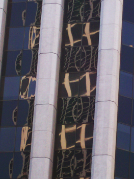
The building I decided to use for this project is in the Financial District in San Francisco. The building is highlighted by a red box and you can see some of the reflections in the window. 


This photo is a close up taken from another angle. I was really interested in how the windows of the building reflected images from the building across the street and it appears that the even-numbered floors are reflection from one angle while the odd-numbered floors are reflecting a different image.

Since the photo is fairly abstract, I wasn’t trying to recreate in exactly. For one thing, there’s not a lot of color in it. And there aren’t any reflections on the far right side. I wanted this quilt to be more symmetrical so I decided to include the reflections on that side also.


To give you an idea of the scale of this quilt, each window is 2.25” high. I decided to create the larger, lighter shapes in the windows by cutting out light-colored fabric and fusing them to the background but I didn’t want to have to do that with the smaller reflections. Instead I looked through my batik fabrics to see if I could find one with a pattern similar to the one in the photo. I found one that I thought was a good fit and it’s green with some blue in it. I also found some other batiks that complimented the green one.


The windows aren’t exactly straight and I wasn’t sure I could piece the subtle angles so I got a piece of fabric and set the batik fabrics on top of it, fusing and stitching to hold them in place. Black bias tape fabric was used to cover the seams.

At first I thought I wanted to do the whitish columns in a light color but once I started to work with the fabric, it didn’t look right to me. I wanted fabric that would be strong enough to support the design element but not stand out too much.  I literally took out every piece of batik fabric to see if it would work and nothing really did. Then I remembered that I had some hand-dyed fabric and found the green piece which did work with the other fabrics.


I pieced the two borders then started quilting. The quilting isn't really visible on the front but it can be seen on the back. I added some black cording on both sides of the green columns then for the binding I used a strip-facing technique.

More about Reflection / Refraction

= = =

Click on the photos to see them larger.

To see the other entries visit the Architectural Elements page.

Wednesday, June 15, 2011

All That Jazz series art quilts

All That Jazz series: Guitar, Saxophone, Piano, Trombone, Bass, and Trumpet, all are 8" x 11"

When I first came up with the idea of doing a series of musical instruments, I knew I wanted to include a piano (because I play the piano), a trumpet (which my husband played), a guitar (which my husband also plays and frankly guitars are just cool) and a saxophone (which is also cool). I wasn’t entirely settled on a sixth instrument and decided I could figure it out as I went.

My first step was to get some reference materials, take some photos and play around with cropping and different angles. Then I used InDesign (a layout program that also has vector drawing capability) to break the instruments down to their simplest shapes. Some art quilters do this with a pencil and tracing paper but I’ve learned that I tend to fudge too much and things get misshapen. By using the computer, I can zoom in to the photo and figure out what that shape is.

Once I’m happy with the drawings I flip them then print them out and trace them on the back of some fusible webbing (since the webbing is on the back of the shapes they need to be reversed so they come out facing the right direction).

Then I fuse the shapes to the fabric, cut them out and lay them back in their correct order. I did the instruments first.

(The text describes the process but the photos are of the finished pieces.)

I started with the piano and since I was envisioning a grand piano, I made the body of the piano in blacks and grays.

Next was the bass. When I started I knew I had the perfect fabric for the body, a mottled brown and tan piece. I love the shapes of the body and the ‘F’ holes.

I made the guitar third and that went pretty well.


Next came the trumpet, although I wasn’t happy with the way it came out so I went back and picked a different angle, made it larger and cropped it more.

Because the other instruments were more solid, I wasn’t thinking about background fabrics but I realized I’d need to with the trumpet since it wasn’t as solid. I had a navy blue batik with lines of multi-colored dots that looked musical.
Since the navy fabric with dots worked so well with the trumpet, I added it to the bass and I really liked it there, also. I wanted to use it with the guitar but the fabric I used on the neck and the side was too dark so I changed it to the brown fabric I used on the bass.

Looking at the piano I realized it would be the only instrument in black so I changed the wood on that to the same as the bass and guitar.
Happy with those four, I started on the saxophone which is a complicated instrument with lots of keys and rods, although fortunately it has a fairly recognizable shape.

At first I tried to include the keys but it looked too cartoonish. Similar to the trumpet I tried another angle and that worked better but it still wasn’t what I wanted. I set it aside.
I looked for ideas for the sixth instrument. French horns and clarinets are complicated, but the trombone was wonderfully simple.

While I working on the trombone I realized why I didn’t like the sax, I was using orange fabrics. Once I changed the orange fabric to the mottled brown from the bass, things started to fall into place.

So the only two instruments that didn’t get totally reworked were the bass and the trombone.
Once I got the instruments themselves complete it was time to work on the collage backgrounds.

I used some brown and cream batiks and tried to incorporate the same fabric in several of the pieces.

Since the piano, guitar and bass had black in their instruments I also black to the sax and trombone backgrounds which really made the other colors pop.


Then I quilted and bound (using my favorite facing technique) and then it was time for the fun part: embellishing!


I couched some brown fun fur around the bass, a gorgeous brown yarn on the guitar and sax, a different brown yarn on the piano and some black cord on the trombone and the guitar.


I used some small bamboo-type beads (taken from a funky necklace I got at a garage sale) on the trombone and trumpet, some brown ceramic beads on the sax, and some white mother-of-pearl beads on the piano. I also added some glass beads.


I used a nylon-coated stainless steel bead stringing wire to make the strings on the guitar and the bass. I’d decided from the beginning that I wanted to have some type of wire for the strings although I wasn’t sure how I was going to do it. It was a little time consuming but I think it was worth it in the end.

More about the All That Jazz series