Friday, February 25, 2011

After the Rain - Project Quilting Time to Vote

"After the Rain" 20.5" x 23.5" Project Quilting, Season 2, Challenge 4: Hardware Store, Feb. 2011

Quick recap of the challenge "Hardware Store":
1. Visit a hardware store. Look around, take some pictures, get a feel for the place.
2. Choose at least 3 different things to be your inspiration. You can use the actual items in your quilt, but are not required to do so. Be sure to tell us about the items and how they inspired you.

Coincidentally, when I saw the challenge for this week, we’d just returned from the hardware store where we’d bought a combination lock (to replace the one we don’t know the combination of). So I went back out.

We have less 4000 people in our village, but we do have a local hardware store, and its part of the Do It Best chain. It’s pretty small, only three aisle and a basement (which oddly enough is actually under the business next door and not under the actual store), so I didn’t need a lot of time to look around. I took a few photos and bought a few things then went home to analyze them.


All of my items had holes in them (I guess I was thinking it would be easier to attach them to a quilt if they already had a hole) and two of the items, the drain cover and the washer, were water related. Then I remembered that there are drain chains that can be used instead of downspouts.

I was ready to start. I knew I wanted to thread yarn and ribbons through the openings on the drain cover, so before I got any fabric out, I got out my yarn and ribbons to see what color combinations I had.

Since embellishments are the last things I put on a quilt, I don’t think about it much during the design stage, but since this was going to be the main focus, I thought I’d start here.

Once I decided which color family I wanted to work with, I started looking through the fabrics. Right away I found a batik fat quarters that had rows of circles which reminded me of drain chains, and two batiks that co-ordinated with it. No need to keep looking.

I figured out the fabric layout quickly, the width determined by that fact that the bottom piece of fabric was a fat quarter, so I just used it all. I pieced the fabrics then started quilting.

The quilting starts at the top with straight vertical lines on top of some of the “drain chains,” then the quilting moves through the thin yellow pieces still as straight lines but this time at angles following the blue printed patterns (more noticeable in the close up photos), and then the quilting moves into the main part of the quilt and the lines are free motion curves following some of the patterns on the fabric and they go all the way down to the bottom of the quilt, representing the way water would travel into the earth. I don’t do a lot of free motion quilting, but it seemed appropriate for this quilt.

I didn’t want a visual binding at the edges so I used a facing technique that I’d just learned, one which makes the corners less bulky.

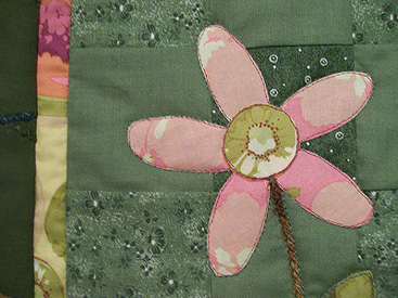
"After the Rain" detail

For the embellishments, I “sewed” gray cording on the drain cover to soften it visually and also threaded several pieces of yarn and ribbon of varying lengths then sewed it on to the quilt. This is the only item that I bought at the hardware store that I used on the quilt.

The embellishment in the upper left corner was made by cutting a piece of cardboard the same size as my washer and wrapping yarn and ribbons around it. I didn’t want to use the actual washer as it was pretty heavy and I didn’t want the extra weight, but I think it’s obvious that it was inspired by the washer. Since the fabric had printed chains on it, I didn’t feel the need to attach the chains to this quilt.

One of my quilting friends admits that hardware stores are her second favorite types of stores, after fabric stores of course. I don’t think I’d go that far, but I do have many items purchased from hardware stores that I use with my quilts including the hanging rods and picture hanging wire.

While working on this challenge, I thought of the many hardware items I used for displays at art shows including: chains and curtain rods (my first display system), pegboard (my second display system), mesh tarps (my third and hopefully final display system), rope, bungee cords, plastic tubes filled with concrete (to use as weights), and removable blue tape (which I use for almost everything).

More about After the Rain


= = =

Click on any of the photos to see them larger.

To see the other entries, go to the Hardware Store page.

Sunday, February 13, 2011

not even the rain: a love poem - Project Quilting Time to Vote


At left: "not even the rain: a love poem" 19" x 26" Project Quilting, Season 2, Challenge 3: Be My Valentine, Feb. 2011  


Quick recap of the challenge "Be My Valentine":
1. The inspiration is Be My Valentine.
2. The main colors of your project will be something other than red or pink although you can use small amounts of red and pink.
3. You cannot use the word "Valentine" on the front of your project but you may use it in the name.

First I started thinking about Valentines and ways people express their love to another person. I thought about love letters, and specifically classic love poems. I decided to include part of the poem “somewhere I have never travelled” by e.e. cummings, which my husband wrote in a love letter to me when we were dating.

Closeup of poem and ginko leaves

somewhere i have never travelled, gladly beyond
any experience, your eyes have their silence:
in your most frail gesture are things which enclose me,
or which i cannot touch because they are too near

your slightest look easily will unclose me
though i have closed myself as fingers,
you open always petal by petal myself as Spring opens
(touching skilfully, mysteriously) her first rose

or if your wish be to close me, i and
my life will shut very beautifully, suddenly,
as when the heart of this flower imagines
the snow carefully everywhere descending;
nothing we are to perceive in this world equals
the power of your intense fragility: whose texture
compels me with the colour of its countries,
rendering death and forever with each breathing

(i do not know what it is about you that closes and opens;
only something in me understands
the voice of your eyes is deeper than all roses)
nobody, not even the rain, has such small hands 

Closeup of the clover and blue flowers

Next I came up with a few design ideas then went into my fabric stash to see what I had in green, blue and purple that made me think of romance. I found a piece of fabric that had 7 different floral and leaf images, so I decided to make a quilt that incorporated items that someone would keep to remind them of their love including the second and final stanza of the poem, some ribbons, heart-shaped beads and charms, a little key and a small bag with a pair of hearts inside.


Closeup of the fern and rose bud

I fussy-cut the floral and leaf fabric (using the leftover piece for the label on the back), printed the text that I wanted to add (the poem and text in two other places). I pieced a thin grayish-green inner border and a yellow/green/blue/tan batik for the outer borders.

Detail of hearts inside a sheer bag on the fern quilt

The six pieces were sewn with a pillowcase binding and then top stitched around the edges. I did quilting stitch-in-the-ditch on both sides of the inner border then quilted around the flowers and leaves. I even added some hand quilting some of the leaves to give them definition.

I wanted to use some fun fur to soften the edges and I wanted it along the outside and not on top of the quilt so I used a zigzag stitch to attach it. Then I added my embellishments.

The final step was to use beads to connect the quilts both vertically and horizontally. (The heart-shaped bead on the second quilt on the right side is actually a navy blue, although it looks black in the photos). The handing rod hangs from a cream colored ribbon.

More about not even the rain


= = =

Click on any of the photos to see them larger.

To see the other entries, go to the Be My Valentine page.

Sunday, January 30, 2011

Sometimes I Dream of Flying - Time to vote on Project Quilting

"Sometimes I Dream of Flying" 38" x 41" Project Quilting, Season 2, Challenge 2: What's in a Name, Jan. 2011

Quick recap of the challenge "What's in a Name":
1. Choose the name of a place, any place with a name that tickles your imagination.
2. Make a quilt using that name as your inspiration.
3. No restrictions on colors, sizes, materials or shapes.

What a great idea for a challenge! I immediately did a search for unusual town names and quickly amassed a long list of possibilities (listed below). I slept on it and woke up Monday morning with a clear favorite, using “Birdseye, Indiana” as my inspiration.

I’ve always loved maps and have been wanted to make a quilt looking down at the earth. I wasn’t sure if I was up to the challenge, so I “drew” out my idea on the computer to make sure I could get the perspective that I wanted.


Close up of the "Birds in the Air" block, also known as: Birds of the Air, Flock of Geese, Flying Birds and Flying Geese

I’ve also wanted to make a quilt that had some traditional quilt blocks but also had elements of an art quilt. I strip pieced the background, piecing the blocks at slight angles to give the perspective of distance. Using some of the same yellow and tan fabrics from the background, I pieced the “Birds in the Air” blocks a light blue background to represent the sky.

I wasn’t completely happy with the way the blocks faded into the background so I decided to add a small dark brown border between the background and the pieced blocks. Then still not satisfied I decided to add the dark brown border to the sides of the background only, to frame it like a picture.

I quilted the fields in the background 1/4" inside of each rectangle and also inside the small, yellow triangles in the "Birds in the Air" blocks. In the larger green parts of the blocks I quilted the echo of the "Birds in the Air" blocks.

Close up of the bird and feathers

I created the bird on a separate piece of fabric, fusing many small dark brown feather-shaped pieces of fabric. I did thread painting on top with both a dark brown and a tan-colored thread to help hold all the pieces down and to also give more definition to the feathers.

Once I decided on the right placement of the bird, I machine appliqued the bird to the background. I pieced together a dark brown fabric with a dark green fabric, cut out a smaller bird-shape and fused it to the background just behind the bird for the bird’s shadow.

The back of the bird before it was attached to the quilt

Aside from the literal having one eye on the hawk, I also made a quilt that was from the perspective of a bird. The working title was “Birdseye” but once I finished, I decided to call it “Sometimes I Dream of Flying.” For some unknown reason, the song “Surrey with the Fringe on Top” from the musical Oklahoma kept running through my head while I was making this quilt, even though I don’t know all the words to that song!

Some of the other town names I considered:

Toad Hop, IN; Frog Pond, NC; Mystic, CT; Harmony, CA; Hourglass, DE; Tie Plant, MS; Walls, MS; Tippecanoe, IN; Big Sky, MT; Checkerboard, MT; Cheesequake, NJ; Zig Zag, OR; Moon, PA or Moonlight, VA; Red Shirt, SD; Echo, TX; Imalone and Ubet, WI; Eight Square, OH; Snowflake, AZ; The Bottle, AL; Sisters, OR; Constellation, AZ; Bat Cave, NC; Triangle, ID; Lightning, ID; Shy Corner, ME; Tree of Knowlege Corner, MA; Two Dot, MT; Gypsy, OK; Black Jack, TX; Zebra, NC; Peacock Crossing, NC; and Frostproof, FL. And in related note of “What's in a name? That which we call a rose by any other name would smell as sweet" there is a Romeo, CO and a Juliette, GA.

More about Sometimes I Dream of Flying


= = =

Click on any of the photos to see them larger.

To see the other entries, go to the What's in a Name page.

Thursday, January 20, 2011

Black and White Quiltette

"Black and White" approx. 7.5" square

The little "quiltette" that I made for the Miami Valley Art Quilt Network holiday exchange. The title isn't exactly true since the fabric image on the front, the binding and the back (below) are all a very dark indigo and white batik fabric, although the bead in the center actually is black and white.
This piece hangs from a black cord wrapped around the black buttons at the top of the quiltette.

Monday, January 17, 2011

Carnival of Colors - Time to vote on Project Quilting

"Carnival of Colors" Made for Project Quilting, Season 2, Challenge 1: Primary Colors, Jan. 2011


Quick recap of the challenge "Primary Colors": 
1. You must use one 6" square of each primary color, red, yellow and blue
2. You may cut each square into no more than 4 pieces
3. You must use the entire 6" square of each primary color project.
4. You may add any other fabrics or materials

Here are the 3 batik fabrics that I used as my primary colors cut into 4 squares, and the 3 other batik fabrics I used for squares.

I played around with the arrangement of the squares, making sure that I didn’t have a row or column with a duplicate color. With the four-by-four arrangement, there was one spot left over. I thought about piecing a square with four different colored triangles but I liked that spot didn’t have as much color so I cut two quarter-square triangle pieces from the green and the brownish-gray fabric as they were less contrast than the color fabric, and I placed them on the fabric leaving two triangle shapes of deep blue background fabric.

I cut three 2” squares, three 2” circles and three 3”x.75” rectangles and arranged them off-center on top of several of the 3” primary color squares. Once I was happy with the arrangements, I fused these shapes and sewed along the raw edges using the same color thread.

I decided that to fuse the 3” squares to the backing fabric but I also wanted to piece some smaller 1” squares into the binding so I pieced the 2” borders and attached them to the backing fabric before I fused the squares 1” apart on the background (otherwise part of the 3” squares along the border would have become smaller because of the seam allowance).


I wanted to do some embellishing so I got a piece of thin gold cording and tried some different arrangements with it and decided I liked how it made the edges look really crisp so I layered the quilt sandwich then quilted the cord on top of the raw edges, which also created smaller squares where the cornerstones would be it the quilt had pieced with sashing.

I also quilted the cord where the backing meets the borders, then I stitch-in-the-ditch quilted inside the squares using the same color fabric as the square that I was in.

More about Carnival of Colors


= = =

Click on any of the photos to see them larger.

To see the other entries, go to the Primary Colors page.

Friday, January 7, 2011

"Spring Forward" and "Kiwi Flowers" in Flower Power!

Me with Kiwi Flowers (left) and Spring Forward (right). Read more about both of these quilts below.

"Spring Forward," made by Pam Geisel, March 2008

I made "Spring Forward" back in 2008. The inspiration for this quilt was the background fabric which had orange and green on it.


The flowers are pieced with orange hand dyed fabrics and the tulip type flowers has hand sewn orange beads.


The ground, stems, and leaves are a green fabric with squiggly waves on it. I also added some green and orange button on the left and right sides of the quilt.

More about Spring Forward 


=  =  =

"Kiwi Flowers," made by Pam Geisel, April, 2008

This quilt was made for an ugly fabric challenge. Everyone who participated was sent this "ugly" fabric to use to make an art quilt. We could add other fabrics to this.

The "ugly" fabric had images of fruit (pears, stonefruit, and kiwis) in pinks, purples, and green printed on a light yellow background.


I pieced a green patchwork background then used raw edge fusible applique to make the flowers which I fussy cut from the pear shapes. I used the kiwis for the center of the flowers (hence the title). I also used the ugly fabric as an inner border and the leaves.


This was the first quilt I did with couched yarn, which I used for the flower stems and also in the outer border. I used a zigzag stitch to couch the variegated yarn but since then I usually couch yarn or cord with a straight stitch using thread that matches the yarn.

=  =  =

Both Spring Forward and Kiwi Flowers are in the “Flower Power” show at the Emporium, 233 Xenia Ave. in Yellow Springs. This show features a wide range of art with floral themes and is being presented by the Jafagirls and the Monday Morning Artists, many of whom painted the sunflowers on St. Rt. 68 just north of the village.

More about Kiwi Flowers

Thursday, January 6, 2011

A Winter Snowscape in Baby It's Cold Outside

"A Winter Snowscape," made by Pam Geisel, December 2006

I made "A Winter Snowscape" back in December of 2006. It is a scrappy pieced quilt with blue and white commercial fabrics. Some of the blue fabrics have stars printed on them in both blue and yellow.


There are four snowflakes with hand quilting to indicate they are rotating as they fall. (Some people have commented that they look like stars or fish and I'm OK with those interpretations.)


The white at the bottom is the snow piling up. One unintended combination of blue and white blocks made heart shapes.

This quilt, along with Crossings and Tropical Sunset can be seen in Studio 14’s “Baby It’s Cold Outside” fiber exhibit. The gallery is located on the second floor of the Benkin building, 14 E. Main St. in Tipp City. The show runs through Feb. 27 and is open Tues.-Sat. from 11 am to 5 pm and Sun. from 1 pm to 5 pm.

As always you can click on the photos to see them larger.

More about A Winter Snowscape.